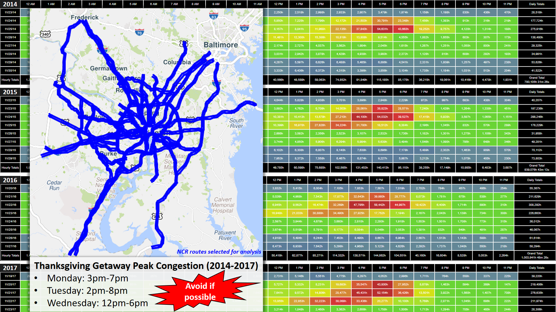
The following visualizations were developed using the Probe Data Analytics (PDA) Suite from the University of Maryland Center for Advanced Transportation Technology Laboratory (CATT Lab). The PDA Suite allows agencies to support operations, planning, analysis, research, and performance measures generation using probe data and other agency transportation data using a variety of data visualization and data retrieval tools. These tools allow users to create and download reports, visualize data on maps or in other interactive graphics, and even download raw data for off-line analysis.
There are two sets of visualizations for the Thanksgiving travel period; Trend Maps & Performance Charts.
- Trend Maps
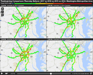
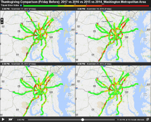
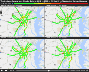
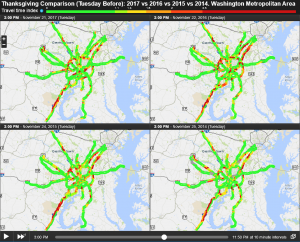
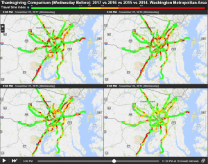
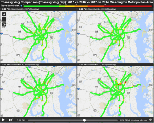
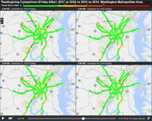
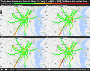
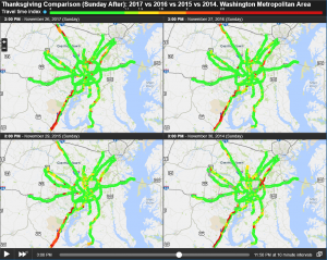
- The trend maps found below allow you to compare a particular Thanksgiving week travel day over the past four years. These maps are interactive and can be animated to visualize how traffic conditions change through out the day. The trend maps reflect the Travel Time Index (TTI) metric.
- Performance Charts
- The performance charts found below allow you to compare how a particular corridor performs over the the Thanksgiving travel period; from the Monday before to the Sunday after Thanksgiving. Red lines on the charts represent traffic departing the Washington metropolitan area while blue lines represent traffic returning to the area. The performance charts reflect the Travel Time Index (TTI) metric.
- The corridors selected are I-270 (MD), I-95 (MD), US-50 (MD), I-95(VA), I-66 (VA), and *I-495 (Capital Beltway).
- *For I-495: Red = Clockwise/Inner Loop, Blue = Counterclockwise/Outer Loop
- User Delay Cost Analysis (Coming Soon)
- User Delay Cost Analysis combines probe speed data with volume data to estimate the cost of delay experienced by drivers as a result of congestion for a given set of roadways. Reports are based on the cost per hour for passenger and commercial vehicles which reflects a passenger’s value of time and commercial operating cost.
Speed Probe Data Definitions:
- Speed: Measured speed (mph)
- Congestion: Measured speed as a percentage of the free flow speed
- Comparative Speed: Measured speed as a percentage of the historic average speed for this time of day and day of the week
- Travel Time Index (TTI): The ratio of the travel time during the peak period to the time required to make the same trip at free-flow speeds. A value of 2.0, for example, indicates a 20-minute free-flow trip requires 40 minutes during the peak period.[/idz_panel]
Trend Map Comparisons (2017 vs 2016 vs 2015 vs 2014): Travel Time Index
Compare how travel patterns change in the lead up to (as well as after) the Thanksgiving Holiday over the past four years.
Performance Charts (Corridor Specific): Travel Time Index
Note how congestion associated with the Thanksgiving holiday travel period is unique to each major corridor within the National Capital Region. Hint: It varies slightly each year.
- US-50 (Maryland) from I-495 to Bay Bridge Toll Plaza
- I-495 (Capital Beltway) Complete Loop
User Delay Cost Analysis: Thanksgiving Week 2017 vs 2016 vs 2015 vs 2014